Bleuwiches Infoscreen
Turning a Simple TV into a Digital Customer Touchpoint
When I worked with Bleuwiches, I looked for ways to make the restaurant feel more modern, easier to navigate, and more connected across physical and digital customer touchpoints. One of those solutions was a digital infoscreen I built using a regular flat-screen TV and ScreenCloud. It replaced static communication with a flexible visual system that could show menu content, support online ordering, and reinforce the brand experience.
Problem
Bleuwiches was a new sandwich shop with an evolving menu and a location that could not rely heavily on casual walk-in traffic alone. A printed menu was limiting: it was harder to update, less dynamic, and did little to guide customers toward faster digital ordering. I needed something that would communicate more clearly inside the space while also making the business feel more polished and intentional.
Solution
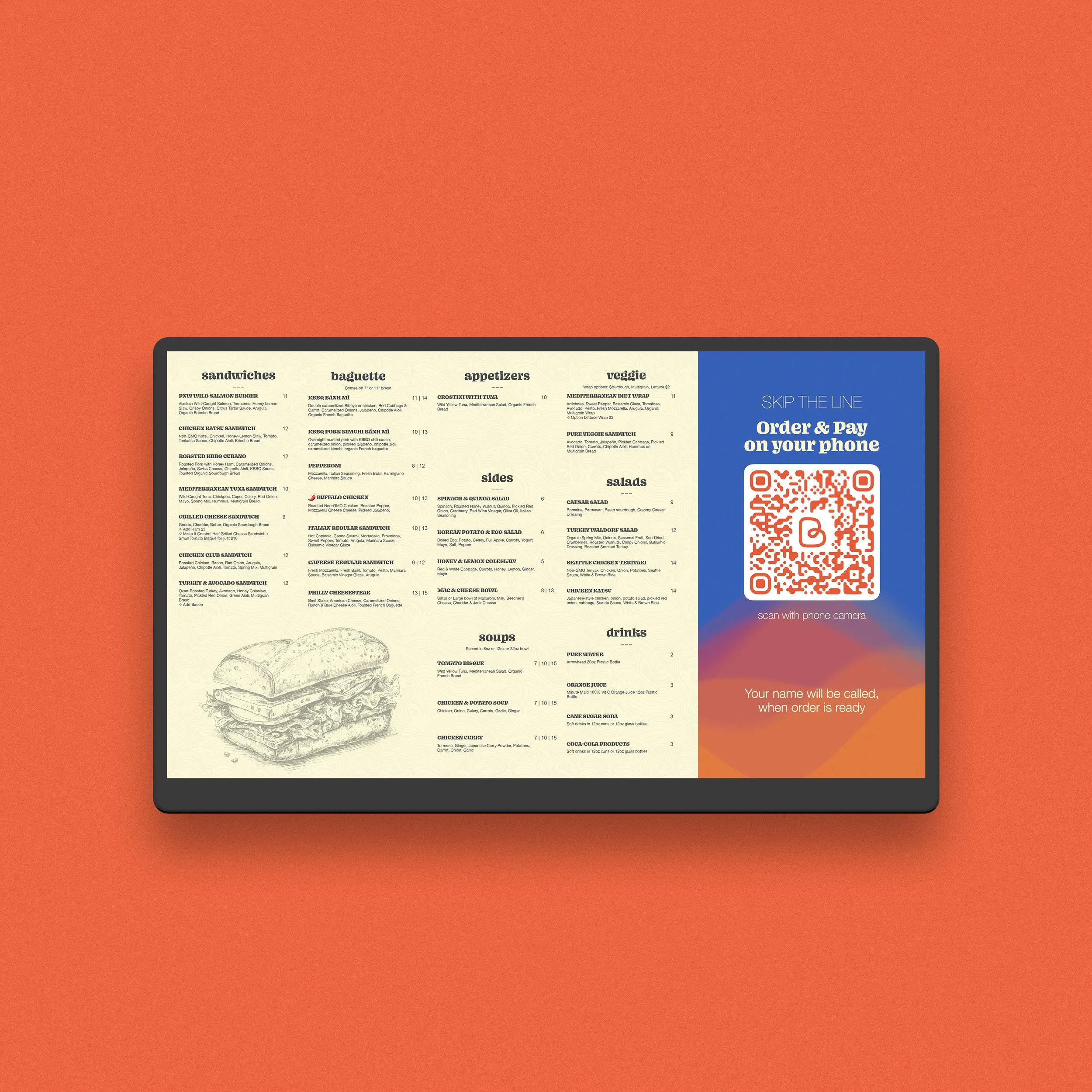
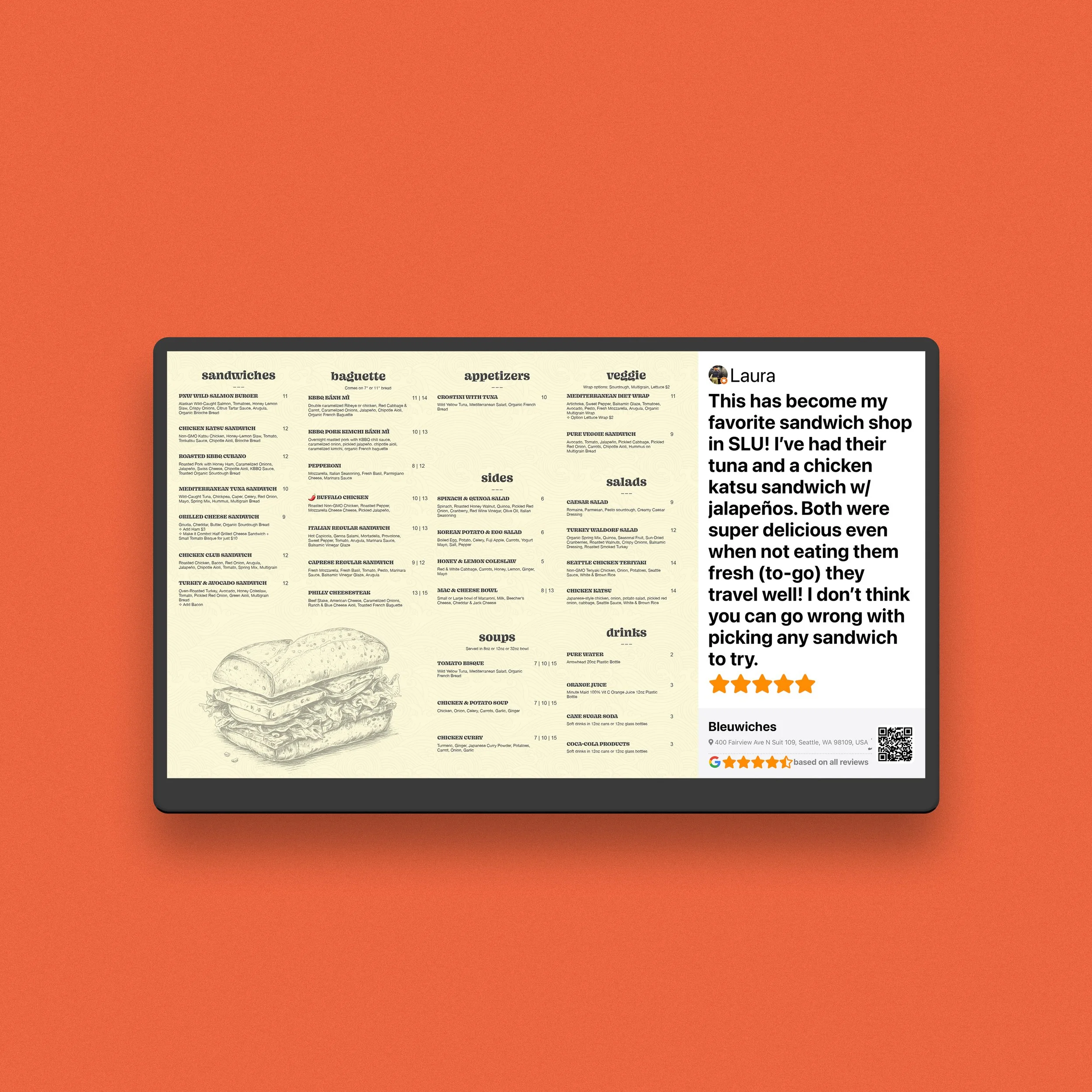
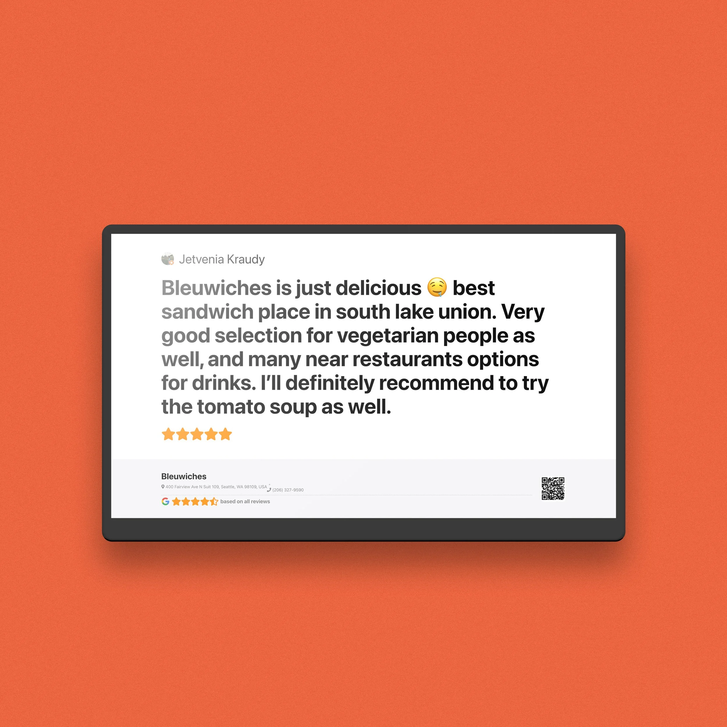
I turned a standard TV into a restaurant infoscreen using ScreenCloud and designed it as part of a broader customer journey system. The screen displayed menu content, visual brand elements, QR-driven ordering prompts, and trust-building content such as reviews and food imagery. It also supported the self-order flow I built around Toast POS, helping customers browse and order more easily from their own phones.
-
The menu changed often, so digital signage gave the restaurant much more flexibility. Instead of reprinting materials or updating things manually on-site, I could refresh the screen remotely and keep the customer-facing presentation aligned with the current menu and brand direction.
-
The infoscreen was designed to do more than show food names. It displayed menu content, online-order prompts, QR codes, customer reviews, and visual elements tied to the restaurant’s identity. My goal was to make the screen feel useful, branded, and persuasive at the same time.
-
I wanted the screen to help reduce friction during ordering, not just decorate the space. That is why I tied it into a “Skip the line” style QR ordering flow. Customers could use their phones to browse and pay, which improved convenience and also fed more customer data into the Toast ecosystem for future follow-up and review requests.
-
Alongside the infoscreen, I configured Toast POS with structured menu items, ingredients, and tags to make food choices clearer. This was especially useful because some menu items used names that did not instantly communicate the protein or dietary fit. The screen helped introduce customers to that system visually before they even began ordering.
-
For me, this project was not really about “putting content on a TV.” It was about reducing friction. A better customer experience starts before checkout: when people understand the menu faster, trust the business more, and feel that ordering is simple, the brand becomes stronger. That was the bigger role of the infoscreen.
-
This project reflects how I think about business touchpoints: website, ordering, reviews, signage, and brand presentation should not feel disconnected. Even a simple screen can become a useful business tool when it is part of a larger system.
Conclusion
I like projects like this because they show that good design is not only about aesthetics. It is also about clarity, flexibility, and making a business easier to use.
In this case, a simple TV became part of a smarter customer journey: more visual, more functional, and easier to update as the business grew.
If your business has customer touchpoints that feel disconnected, outdated, or underused, this is exactly the kind of problem I enjoy solving.